Kinderstad, one brand from two organisations: branding for the merger of Opmaat Kinderopvang and Opmaat groep

Two organisations that look alike, and yet differ.
"The trick is to find the sweet spot: one brand foundation that both organisations recognise in themselves and that carries their shared ambition."
Opmaat Kinderopvang and Opmaat groep, fifteen years of state education, merged into a single foundation. That new organisation needed a name and brand of its own: a foundation in which both the childcare and the schools could see themselves.
Schwung guided the entire process. From positioning and name development to brand values, proposition and the complete visual identity, all captured in a set of brand guidelines.
Different in character, alike at heart.
As early as the merger phase one thing was clear: the two organisations look alike, but they also differ. Where do they overlap, and where does each have its own character?
Community childcare
- Quality and pedagogical policy come first
- A rich play-and-learn environment as the «third educator»
- Broadly accessible, for every child
- Learning through play, the child's autonomy
- A strong position in the neighbourhood (including Reeshof)
State education
- Performance-focused through HPO, every child can learn anything
- High expectations, the teacher at the centre
- Education grounded in research
- Meeting, connecting and being open to society
- Equal opportunity and equality
The sweet spot, where they meet
- Quality held in high regard
- Equal opportunity: an equal start for every child
- Broad accessibility, in every neighbourhood of Tilburg
- The child's development comes first
- Diversity and inclusivity
- One continuous development path from 0 to 13 years
DIY branding: building the brand foundation together.
The approach followed the Schwung DIY branding model. In a series of workshops we guided groups from both organisations through the brand development work. Together we searched for the values, the audacious ideal and the Why-How-What, as a springboard towards one overarching proposition.
At times it was tough: none of the participants were used to brand work. But that was exactly where the strength lay. Everyone stood as one to make a valuable contribution. And they pulled it off.
Intake & brand research
Conversations with the board and management, plus brand-awareness and image research among parents and staff.
Audacious ideal
A bold future goal (BHAG) as an energiser, where does the organisation want to be in 10 to 20 years?
Golden Circle
Sinek's Why, How & What: thinking from the inside out, towards a logical and compact brand description.
Core values
From image to language. Finding together the values that unmistakably belong to the new organisation.
Proposition & story
The translation into proposition, corporate story and pay-off, the internal story, ready for the market.
Name & brand architecture
The choice of one overarching name, with endorsement towards the underlying locations and schools.
From why to what.
The heart of the process: via the audacious ideal, Golden Circle and values towards mission, vision and corporate story. The basis for everything that follows.

Kinderstad, one city to grow up in.
One organisation for childcare and primary education in the Tilburg region, born from the merger of Opmaat groep and Opmaat Kinderopvang. For children aged 0 to 13.
Across fourteen community childcare locations and sixteen state primary schools, we help children and staff alike grow into the best version of themselves. With us, children discover what they have in them, through proven methods, valuable partnerships, and above all by truly seeing the child.
Three values that make the difference.
We do it together
Connecting and collaborating are central, between childcare and education, and with parents, children, partners and the neighbourhood.
We nurture growth
Every day is about growth. Children arrive as babies and leave as budding pupils, and we grow right alongside them.
We stand for quality
We feel the responsibility for the children entrusted to us. That is why we constantly strive for quality in everything we do.
"The new Kinderstad logo is exactly what we hoped to find for our organisation. It fits our brand values."
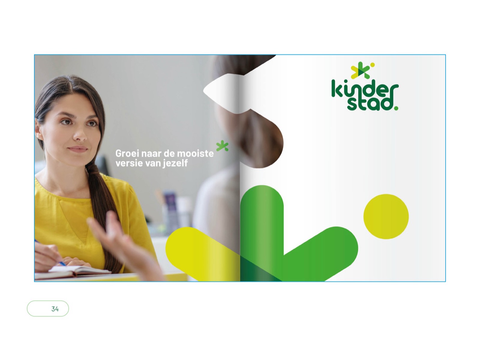
From brand foundation to visual identity.
After the foundation came the translation into imagery: a playful, sparkling wordmark and pictorial mark, with the pay-off «Grow into the best version of yourself».
The asterisk: one mark, many meanings.
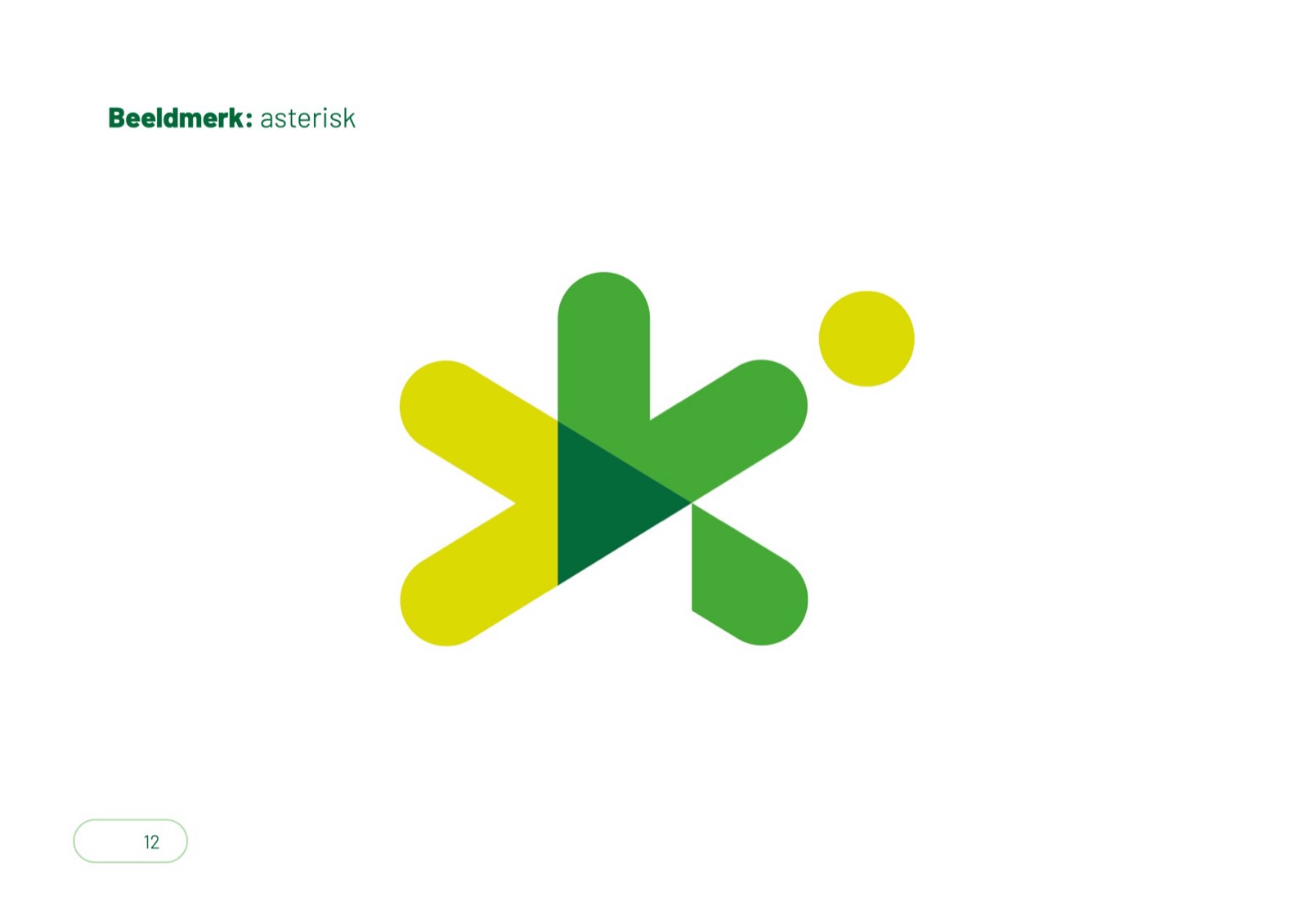
The asterisk (✳) has always pointed to a footnote. In the visual identity it signals that Kinderstad is made up of several parts: childcare and primary education, and the individual locations.
What the mark tells
- An abstract letter K for Kinderstad
- A beating heart, truly seeing the child
- A symbol of sparkle & growth
- Purposeful, the point pointing forward
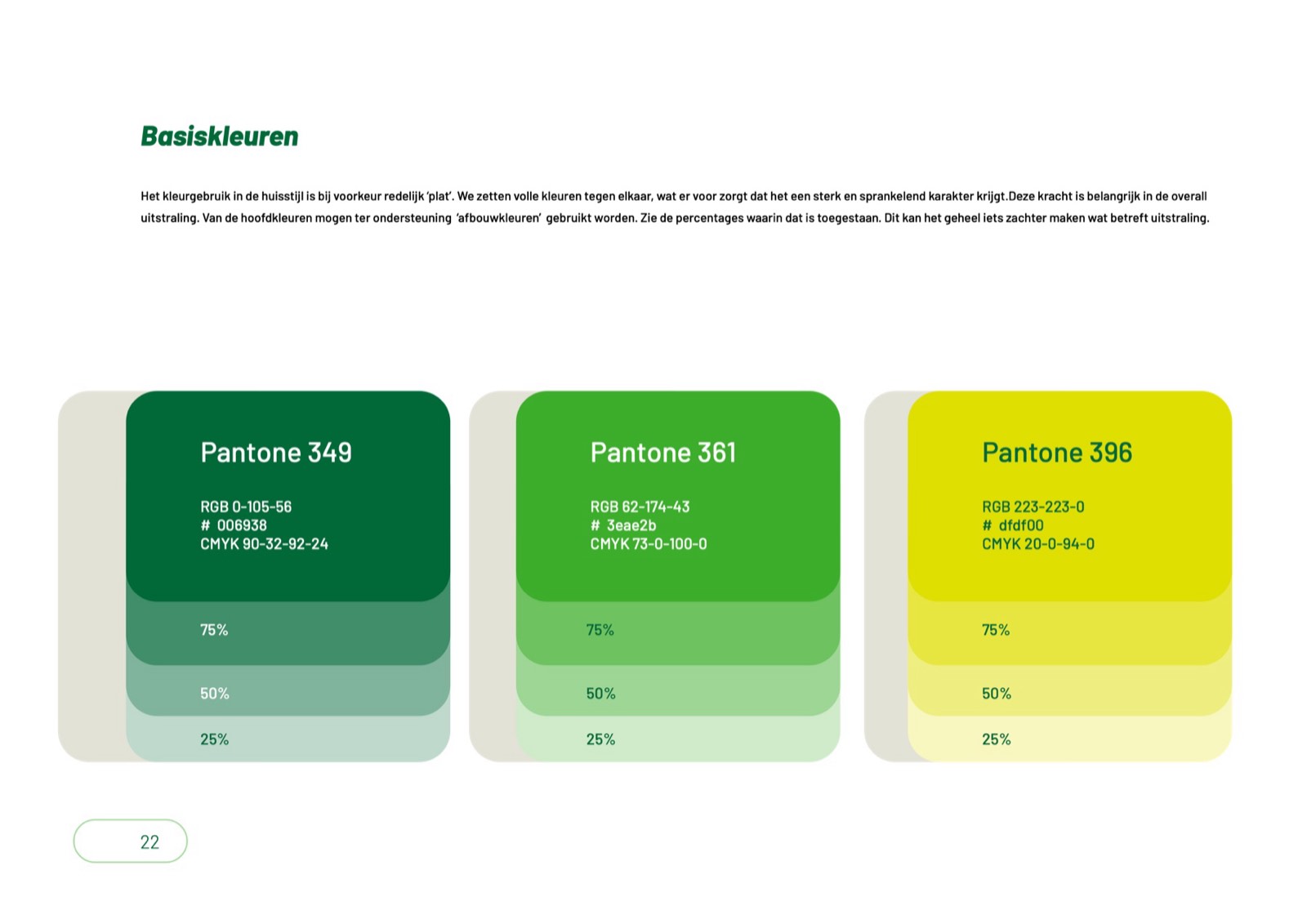
Full, flat and sparkling.
Full colours set against each other, that gives the brand a strong, fresh character. Three greens and a lime yellow, with Barlow as a calm, friendly typeface.
One family, room for individuality.
Kinderstad is an overarching organisation. As the brand strategy we chose endorsement: the main brand stays visible, but the parts keep room for a face of their own.
In line with the brand
- The location name in the same visual language
- The asterisk references the parent organisation
- Type of service as an addition (childcare, after-school care, sport)
Their own identity, yet connected
- Freedom to run a visual identity of their own
- Required to carry the label «part of Kinderstad»
- Or align with the Kinderstad style, just like the childcare
The brand in use.


A brand you feel.
As an introduction, Schwung also supported the development of a short video, used to launch the new brand both internally and externally. That way Kinderstad landed not only on paper, but with people too.
What Schwung did
Positioning & name
Brand foundation & brand values
Visual identity & logo
Brand guidelines
Introduction video
Grow into the best version of yourself.
Who did what.
Client
Kinderstad, childcare & primary education, Tilburg region. Born from the merger of Opmaat groep and Opmaat Kinderopvang.
Schwung
Brand strategy, name & positioning (DIY branding), visual identity, wordmark and pictorial mark, brand guidelines and introduction video. Facilitation of workshops with both organisations.
A brand that truly takes your brand further?
Whether it is a merger, a new name or a fresh visual identity, we would love to explore where the sweet spot lies.